


Home Articles Web design & development Tips for choosing fonts for websites

When designing a website, fonts and typography (the way copy is displayed) often fall down the priority list to colours and other visual elements. Yet choosing fonts for websites can significantly affect the look and message a web page conveys.
Selecting fonts for your website
When selecting a font for your website, there are a few things to keep in mind:
- Is it web-safe? Web-safe fonts don’t pixelate or blur when displayed on monitors, which can often happen with traditional print-friendly fonts. They are also commonly found on most computers. If you choose a font that many computers don’t have pre-installed, the font will not display unless the user has also downloaded it. The browser will load its default font instead. A few years ago, a web designer or developer’s choice of fonts was restricted to a small group of web-safe fonts. This has now changed, and there is a large selection of web-safe fonts available.
- How much does it cost? A premium font may give your website an original look, but it will also take a huge chunk from your design budget. Especially if you have to buy the licence for a font family to use for web design, but also for use on mobile devices and print. Some font licences are even priced according to the number of website visits you receive. If you have a lot of visitors, that can easily add up to quite a sum. Check what’s included in the costs before selecting the right font for your website.
- Does it support most common platforms? In some cases, different operating systems and mobile devices can cause font display errors. This can sometimes mess up the look of the entire website by displaying distorted text. Check what browsers your selected font supports and make sure that all the major ones are covered.
- How quickly does it load? Quick download speeds are essential for a good website to keep visitors engaged. Check that your chosen web font will load quickly and not slow your website down to provide users with the best possible experience when visiting your website.
- Is it in keeping with your brand? When selecting the font for your website, consider the audience, purpose of the page and the style and message you want to convey. Is the font in keeping with your brand? Does it communicate and enhance your message?
Using different fonts together
Once you have selected your font, consider using them to enhance the message you’re trying to convey. On any web page, there is usually more than one type of text. Depending on what you are trying to achieve, different typefaces or fonts, when used together, can have different effects. These can be classified as concordant, conflicting or contrasting.
Concordant. This is where one type of font is used without much variety in style, size and weight. Italics and larger headers can give some variety. It gives a harmonious and quiet feel and could be described as formal, or even dull. However, some situations require this type of feel. So concordant is not necessarily bad, but you should be aware of the impression you are creating.
Conflicting. This describes fonts that are similar but not the same. In this situation, the similarities can be disturbing, so they conflict. When two fonts look alike but are not, it can look like a mistake. This is one to avoid.
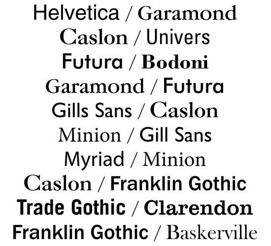
Contrasting. This is when fonts that are distinctly separate and different are combined. This is often visually appealing and exciting as strong contrasts attract our attention. Contrasting fonts can enhance communication as attention is drawn to key areas. Fonts can contrast in several ways including size, weight, structure, form, direction and colour.
Considering these factors when choosing fonts and adding content to your web pages, can make a big difference to how effective your website is at attracting, engaging and communicating to your target audience and making sure they return time and again.
Popular web fonts
Although there are many fonts to choose from, the fonts used on websites tend to be serif and sans serif fonts as they are modern, easy to read and web-safe, so more readily accessible to most users.
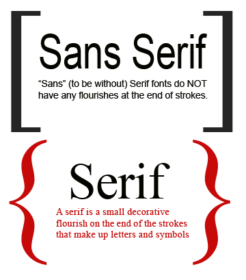
Serif fonts. “Serifs” are the small finishing strokes on the end of a character. Example serif fonts include Time New Roman, Palatino and Garamond.
Sans serif. “Sans serif” fonts do not have these small finishing strokes. Examples of sans serif fonts include – Arial, Helvetica, Tahoma and Verdana.
Google fonts
The choice of web-safe fonts increased with the introduction of Google fonts, for example – which do not rely on users having fonts pre-installed on their computer. With over 680 font families to choose from, Google Fonts come with plenty of great perks and features.
Free to use: Google fonts are free of charge and don’t have any restrictions on how you can use them, as they are all released under Open Source licences. You are free to select any font in the database and use as many fonts as you want. You can download, customise, print, use them on commercial projects and much more.
unlimited usage. Google Fonts doesn’t have a bandwidth or pageview limitation. This allows you to use any font on any number of websites with no obligations.
Google Fonts serve billions of page views every month for free, unlike other subscription services that limit their font use to the number of page views per month for each website.
Increased accessibility. Google Fonts allows the browser to connect to Google to get the font – instead of looking at the fonts on your computer. Therefore every user can see the custom Google font, even if it not already pre-installed on their computer. This allows designers to choose from many customised fonts instead.
Quick to download. Google Fonts are much lighter than other font libraries or self-hosted fonts. Each font has been compressed for speedier download, allowing web pages to download in a split second on any platform, without affecting the font quality.


